Insightly Gmail Sidebar
Design process for a Insightly’s Gmail extension.
Background
The Insightly Gmail Sidebar is an extension that connects a user’s Insightly CRM to their Gmail account. It has two primary functions:
Accessing CRM data within Gmail, so that they can compose emails more efficiently.
Import email and contact info from Gmail directly to Insightly.
Design Challenge
The goal of this project was to redesign the Insightly sidebar, such that it:
Improved usability
Addressed common customer complaints, as reported by the support team
Became an additional selling-point for the CRM
My Role
My role for this project was Lead Designer. I held regular design review meetings with the VP of Product and the Design Manager. I worked with a Senior Web Developer on implementation. As Lead Designer, I was responsible for:
Internal audits and competitive analyses
Mapping out the user journey and running user-research calls
Collecting insights and feedback from the PM and other stakeholders
Experimental design of user research and conducting user labs
Providing all final design deliverables, including lo-fi and hi-fi designs and prototypes
Delivering development specs to engineering team and assisting with QA process
Experience Map
The first step was mapping out the existing user experience. I wanted to understand all existing use cases and the rationale behind them. I accomplished this by laying out all the screens and cases with post-its.
I also worked with a product manager and a data analyst to understand the features and user paths that have the highest business value or potential value, along with the most common requests and user complaints.
The team then synthesized this data into these principal user stories:
As a frequent user, I want import an email and all of its contents into my Insightly account, so that I can include it in the customer record
As a frequent user, I want control of the content that i download from my emails to my CRM, so that I can save storage space
As a frequent user, I want to access the Insightly record of the senders and recipients in my inbox, so that I can more efficiently write informed emails
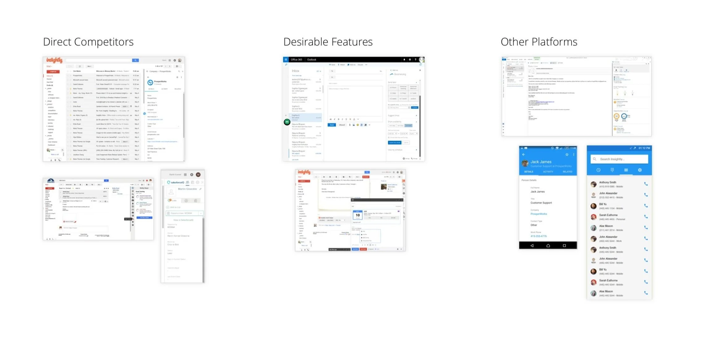
RESEARCH & Audit
External Audit
To understand the competitive landscape, I did a thorough audit of similar apps and the related features in other apps. This was a key step in achieving the goal of turning this sidebar into both a selling point and a driver of user retention.
User Calls
The data and audit were indispensable in shaping the product stories, but the most important part of this process was seeing the user perspective in action. Since my primary focus was to improve functionality for existing users and increase adoption by new users, I made them my main research pool and scheduled calls with:
Frequent users of the existing sidebar
Insightly users who downloaded the sidebar but dropped off after a few uses
During the video calls, the users were asked to share their screen. I asked all users to walk me through our user stories. In addition, I asked existing users to walk me through their routine tasks on the sidebar.
RESEARCH FINDINGS
Complex Navigation
Navigation was problematic. All sections were given equal weight on the primary navigation, so users didn’t know where to start.
Users had to hover over an email to access its info, but there was no instruction or affordance indicating to do so.

Flawed “Killer Feature”
The most important feature on the sidebar is the ability to download emails into Insightly. However, this was also the most complained about feature.
The feature had poor discoverability and lacked the proper affordance, so some users could not find it, or did not know what that “in” button does. Additionally, saving emails did not give users the options of omitting attachments, which resulted in some users meeting their quota simply from downloading email signatures with social media icons.
Unhelpful Data
Half of the users that we spoke with did not find much use in the information that the sidebar served up. Several users cited the desire for a profile view with basic summary of the email sender to assist in email composition.

Design Explorations and Solutions
Design Lab
After completing the initial research cycle, we moved on to explore solutions to the questions and design problems that had emerged.
This process involved sketching myriad options for:
Navigation schemes
Presenting valuable, actionable information
Fitting everything together into clear flows
I made these early solutions as low-fi sketches on paper, or sometimes in white-boarding sessions. The different options were reviewed with the head of design and VP of product. We analyzed the pros and cons for each approach, and narrowed down to the best options to test as prototypes in front of users.

User-Testing Prototypes
The early explorations were refined and iterated upon until we had arrived on options to present to users.
For the problem of simplifying navigation, I made two initial prototypes options in Invision, and instructed users to complete common tasks.
Similar prototype tests were conducted on users when testing information discoverability.
These user labs were fundamental in ensuring that users understood the basic design before we further invested in it. After each round of prototype tests, I incorporated new insights and updates, and ran follow-up tests if necessary.

Visual Design
After the flow outlines, information hierarchy, and testing was complete, I proceeded to focus on more detailed visual design. My philosophical approach was to keep thinks stylistically similar to the Insightly brand, but in such a way that did not clash with Google’s UI.
More importantly, I wanted the color and aesthetic decisions to be used to elevate the function.
As part of this process, I made several options for each major screen, designed graphic assets, and ran design critiques to received feedback from stakeholders. In the end, the final hi-fi visual design files were thoroughly annotated and handed off to developers. During this process, I made myself available to developers for any assistance, and also did QA work to help attain pixel perfection.


FINAL DESIGN
The final sidebar design has four primary functions:
Allowing a user to select senders/recipients of an email and viewing their Insightly profile and records
Viewing Insightly tasks and adding tasks to their CRM
Tracking interaction stats from email campaigns run from Insightly
A universal search that allows users to search for data elements in their CRM

Updated Navigation
The navigation prototype tests revealed that the user preference was a single row navigation with functional tabs on the left, and universal actions on the right.
When accessed, the search feature takes over the entire row, which de-clutters the screen and reduces ambiguities caused by stacked, yet unrelated actions.


Save Tools
One of the main user peeves was that the “Save to Insightly” tool automatically saved all of an emails attachments, including all the social media icons to their CRM. This ate up a ton of storage space and was a major reason why users dropped off from using the sidebar.
Our approach was that we wanted to give users the option to not save attachments, but also not introduce complexity into what was already a one click process. To resolve this, we introduced a button that had a main function of one-click save, but also had a secondary dropdown that allowed them to access more complex save tools.
As a response to the requests of many sales-oriented users, we introduced a sub-flow that allowed users to save a new entity into Insightly as either a Contact or a Lead.
These more complex functions were nestled within the secondary button function, so they did not introduce new complexity to the average user’s flow.

Surfacing the Right Information
The selected record information was redesigned with two questions in mind: What does a sidebar user want to see? Where does the user expect to see this information?
To answer the first question, we utilized our findings from users calls, and also sent out a poll to frequent users asking what data would be most valuable in a new gmail sidebar.
To determine order, I looked at the frequency at which different data objects were accessed in the CRM and supplemented this by card sorting exercises with users in testing.
Because emails are written to people and not "deals” or “projects”, the first information surfaced is a sender profile. This serves up a summary of the email sender, with basic biographical information, and links to all records that they are associated with. The profile functions as a jumping-off point for any other CRM info.
Results and Future Iterations
Conclusion
The final design was happily received by customers—especially the improved navigation and our solutions to the attachment functionality.
The added control over how to save “people” from Gmail to Insightly resulted in more data and cleaner data in a user’s CRM, which is positively correlated with retention rates.
Future Iterations
In the competitive audit, we encountered some competing CRM sidebars that featured powerful email composition tools. In particular utilizing templates, scheduling delivery, and email tracking. Although these features were available in Insightly itself, we were not technically capable of integrating them into Gmail. Based on the use of these email tools and the percentage of Insightly users who are on Gmail, this could be a key feature.

Timeline View
I think there would be value in testing a timeline view of a user profile. I hypothesize that for some users composing an email, it is more important to see what recently happened with a customer than what historically happened. Thus I would test a timeline view for user profiles. Perhaps these views could be toggled by the user.
